The answer is simple – inbound linking cannot hurt your search ranking. How is this known for certain? Well, for one, if inbound were to hurt your rank, your competitors would continually link to your site from link farms. Such a scenario is beyond your control. For this reason, Google cannot penalize your site for any inbound linking.
On the other hand, you can be penalized for illegitimate external linking. It is highly advised that you not link to any website or group of sites that may be involved in shady or unethical search practices. Doing so could result in being black-listed by Google, ultimately ruining your SEO strategy. Avoid this situation at all costs and ensure that all external links point to trusted and reliable sources.
Having been involved in the internet industry for a large part of my working life, I have spent a lot of time researching and browsing the internet and reading websites, mainly for client design research, but also for occasional personal use. The one thing that I find most disappointing, is the apparent lack of thought going into website creation and it’s purpose, which in turn creates a missed opportunity for many e-businesses to become successful.
My personal perspective on e-businesses and their websites, is that if they don’t take pride in their websites and show to their customers a passion for what they do, chances are, they won’t take pride in their products, and the passion for providing good customer service will also be missing.
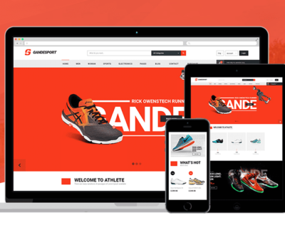
What you must remember, is that your web site is a direct reflection of you and your business. The appearance of your site is the most important factor in determining your potential success rate. In short, if your site doesn’t look professional or pleasing to the eyes at first glance, the majority of people will assume your products and/or services to be of similar poor standard.
At the other end of the scale, you could fall into the trap of going overboard with the design and over complicate things with incorporating high costing flashy graphics. You may end up with a great looking and highly aesthetic web site, but the danger with this is that your site may prove unreliable and at times may take too long to load. There is nothing worse for a customer than trying to visit a slow loading site, and most will close the browser window in complete frustration. As i’m sure you will be able to work out, this will ultimately cost you business.
The other major consideration (if not the most important) when designing a website is your content. Not just links, but content with passion, relativity, and understanding to the customer. When someone is searching for something in particular and they visit your web site, they’re visiting for a reason. Your site has something they want, Whether this be your product, service, and/or information. If they are unable to obtain what they’re looking for, they move on to the next site and so on. To be able to get your visitors to stay and look around your website, you must give them a reason to. Providing them with quality content will achieve this goal.
There have been countless other lists and articles on the subject of website designing mistakes, but I have compiled my own list, from a designer’s perspective, of some pitfalls to look out for when considering either designing a website or purchasing a template. Remember that the simple, clear, informative and well designed sites are the most successful. If you are a current e-business and your sales aren’t what you had hoped, consider the above and take some time to look openly and honestly at your site. Spending money on improving your website is a much better investment than throwing money away on trying to advertise and market a site that just isn’t good enough to sell your product or services.
If you are looking for a template or a custom designed website, be aware of the above and be prepared to ask your chosen designer or template provider questions to ensure that your hard earned money doesn’t go to waste on an inferior design, which contains any of the above. Asking questions won’t cost you a penny, and in doing so could actually save you a lot of money over the long term. Getting your website right first time is vital in terms of saving money and time. The earlier your website is up and running properly, the quicker you will be able to reap the rewards of a successful e-business.
The prime mistake Newbies make is to put their website name into the Anchor Text. Unless your website contains your keywords this is a waste of a perfectly good link. Remember that Google puts a very big importance on those Anchor texts and they should always use your keywords.
The second mistake is trying to put every single keyword into your anchor text and give that to everyone. There are two mistakes with this technique. 1.) Google assigns weight to each word in anchor text so if there are a lot of filler words (common in long sentences), they will “dilute” your target words.
According to two recent surveys, conducted by Forrester Research and Gartner Group, ecommerce sites are losing $1.1 to $1.3 billion in revenue each year due to customers click- away caused by slow loading sites. If a page takes too long to load, your potential customer will not wait. Ultimately costing you business.
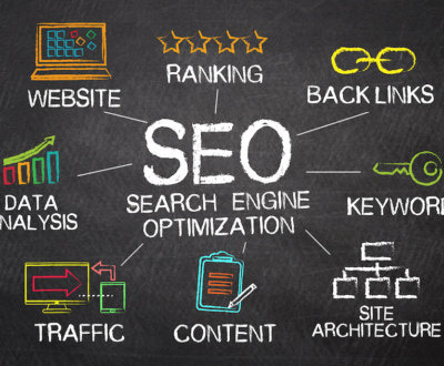
Make sure you include proper META tags in the HTML of each page of your web site. META tags are HTML code that enable the search engines to determine what keywords are relevant to a specific site. About 80 percent of all web site traffic originates from the eight major search engines. It would be a good idea to make sure you’ve done your homework and fully understand how to optimize your web pages prior to designing your site. This will save you a lot of headaches in the long run. For further information on META tags read the tutorial entitled, “Building Your Site.”
Be cautious when selecting your background and text colors. Busy backgrounds make text difficult to read and draw the attention away from the text. Always be consistent with your background theme on each page of your site. Your site should be nicely organized and uniform throughout. Keep in mind, colors affect your mood and will have an affect on your visitors as well. Bright colors such as yellow and orange, cause you to become more cheerful or happy, while colors such as blue and purple have a calming effect. Dark colors such as brown and black have a depressing effect. A good rule of thumb would be to use colors based upon the type of effect you’re trying to achieve.
Your main page should specifically let your visitors know exactly what you’re offering. How many times have you visited a site and never figured out exactly what they were selling? If your potential customer can’t find your product or service, they definitely won’t waste a lot of time looking for it. They’ll go on to the next site and probably never return. They’re visiting your site for a specific purpose. They want something your site offers. Whether it is information, a product or service.
Design your site to be easily navigated. Place your navigation links together at the top, bottom, left or right side of the page. Use tables to neatly align your links. If you are planning on using graphic buttons to navigate your site, keep in mind that with each graphic you add to your page, it will take that much longer for your page to load. If you only have a handful of navigational links, using graphic buttons will be fine. If you have over six links, it would be wise to simply use text links to keep your load time down.
If you must use frames, use them sparingly. Frames, if not properly used, can make your site look unprofessional. Avoid making your visitors have to scroll from side to side to view your content. This can be very irritating and cause your visitors to leave. If you must use frames, offer your visitors a choice. Frames verses No Frames. Try to keep the number of clicks required to get from your main page to any other page on your site down to four. Keep in mind, your visitors may enter your site from pages other than your main. Always have good navigational links on every page and place your company logo on each page.
Design a quality e-book to give to your visitors. It’s not as difficult as it sounds. If you can create a web page, you can create an e-book. The focus of your e-book should compliment your web site. Simply write about your passion. If your passion is sales, then you could share some of your knowledge and experience by designing your e-book to provide a complete sales training guide. If your passion is home based business, you could write an e-book about how to start your own home based business. If you’re writing about your true passion then you shouldn’t have any trouble coming up with something to write about. For further information on e-books, read the article entitled, “How to Create an E-book and Drive Massive Traffic to Your Site by Giving It Away.”
Having been involved in the internet industry for a large part of my working life, I have spent a lot of time researching and browsing the internet and reading websites, mainly for client design research, but also for occasional personal use. The one thing that I find most disappointing, is the apparent lack of thought going into website creation and it’s purpose, which in turn creates a missed opportunity for many e-businesses to become successful.
Kevin Zhou, the founder of GoldWebs website and online digital marketing agency, has the great insight into internet and know-hows in leveraging the power of website and online marketing, aiming to help SME business in achieving superb results with excessive business leads and sales in the field. 服务范围包括:电商网站SEO,悉尼定制网站设计公司,悉尼好的网站公司,澳洲电商,在澳洲做电商,澳洲电商独立站定制,推荐好的网站设计公司,网站推广,生意推广,获客方法,海外营销,Digital Marketing, 谷歌SEO搜索排名,跨境电商独立站,网页设计,澳洲网络营销,电商运营,线上获客,澳洲做线上生意,谷歌搜索广告咨询
More from our blog
See all postsRecent Posts
- 2024澳洲悉尼华人网站设计公司首选:澳洲金网 www.goldwebs.com.au(建议惠存网站地址) June 19, 2024
- 独立站优化方案:月销售额过百万,手把手教你做独立站 September 15, 2023
- 2023如何在 Google 上让网站排名更高的10个关键点 September 13, 2023
- 悉尼数字化商战:故事揭秘,如何通过专业网站与SEO制胜市场 August 10, 2023
- 澳洲金网案例分享:Aurora家居创新公司的数字化转型之旅 August 8, 2023
- 悉尼专业数字化服务帮助中小生意向线上转型的三个成功案例 August 8, 2023
- 悉尼特色礼品店的数字化线上推广之路 August 7, 2023
- 产品独立站靠Google Ads广告怎么做才能带来更多的客流 August 7, 2023
- 澳洲小礼品店用数字化线上推广点燃市场的故事 August 2, 2023







口碑相传,品质为先,我们的价格简单透明,无数客户的经验告诉我们,再便宜的烂网站和服务,其实才是最贵的,因为给您产生财富和价值的您的宝贵的时间,精力和生意品牌,才是更重要和有价值的 — 澳洲金网 澳洲网站设计制作专家 http://www.GoldWebs.com.au